Choosing the Right Yarn Colors
There’s nothing worse than being half-way through a project and realizing you absolutely hate the color choice (been there). If you’re like me, the first thing you do is go when you pick a new pattern is go to the pattern page on Ravelry and see other examples. This typically helps me narrow down yarn brand, and sometimes, color choices. Also, if you’re like me, you end up spending hours looking at all the possibilities, sometimes getting overwhelmed with choices and telling yourself you’ll figure it out later.
Every person’s version of a pattern is unique to them, so going in with a plan and color palette can help keep things organized and in control, so you know what to expect with your FO.
I typically like to think about my color choices in terms of different color palettes/tones. I make my color choices based on many different things — what season it might be worn, complimenting a skin tone/eye color, or even based on the age of the recipient. Sometimes, my color choice is specifically based on the pattern I’m work on, especially if it’s a very specific design where color can make or break the appearance of the stitches.
Below, I created a fun little set of color palettes based on my typical themes using my stashed yarn. During this process, I realized that I’m seriously lacking in certain colors, so this seems like a great excuse to buy more yarn.
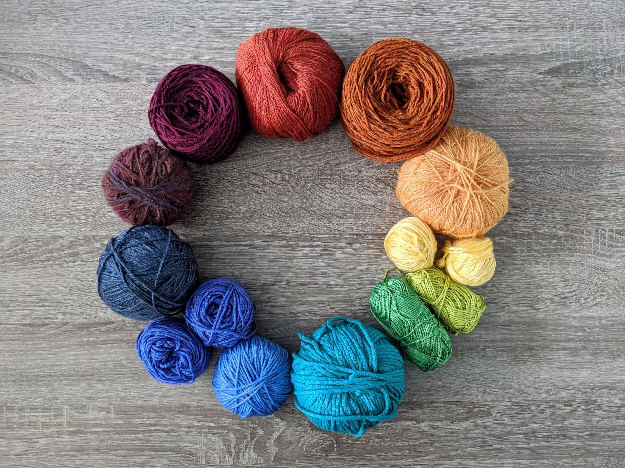
Jewel Tones
Color palette: topaz blue, emerald green, sapphire blue, amethyst purple, ruby red, garnet red, and citrine yellow.
This is kind of my go-to palette as the colors are deeply saturated and rich. Jewel tones work especially well when using a pattern where you want the stitches to stand out, such as cabling. The rich tones will really show off that stitch definition, something that would otherwise get lost in lighter, less saturated color choices.
Season: Jewel tones are often worn a lot during fall, as the colors mimic the colors of the changing leaves.
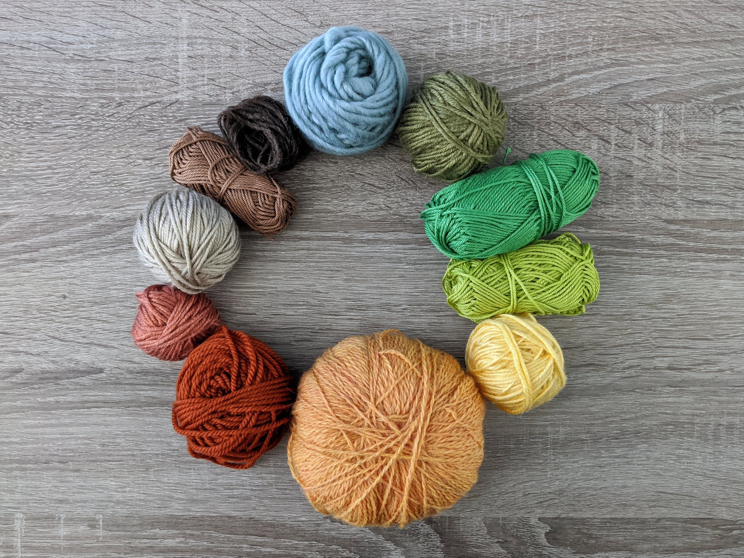
Earth Tones
Color palette: leafy and grassy greens, golden sun tones, clay and brick reds, earthy browns, and sky blues.
This palette is most often simplified into greens and browns, but there’s really much more to this palette. Think about what you see when you walk outside. These tones are more natural and slightly neutral, and typically have a feeling of warmth and relaxation.
Season: Earth tones are typically worn year-round, but are more popular around fall and winter, as they are a bit more neutral.
Bright Tones
Color palette: typically primary (red, yellow, blue) and secondary (orange, green, purple) colors and bright blends of those colors.
This palette is typically considered more fun and carefree with bold, happy hues that are heavily-pigmented and eye-catching. Floral patterns often use these palettes as these colors are meant to stand out, not blend in.
Season: Bright tones are typically worn more during the spring and summer months, as they reflect the colors of blooming flowers.
Pastel Tones
Color palette: mint green, powder blue, lavender purple, cotton candy pink, and lemon yellow
This palette encompasses pale, soft tones. It is most-often used in a more relaxing way, which lends itself often to baby items. These colors are low-saturation, so they all blend together to feel soft and sweet. This also means that it won’t show off stitches such as cables as well as something a little more deeply saturated.
Season: Pastel tones are typically worn in winter and spring, as they can give off the feelings of both an icy chill as well as a budding flower.
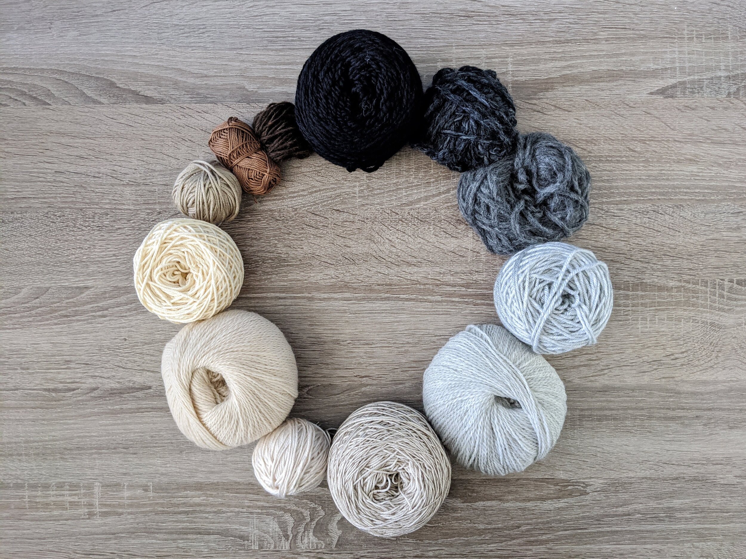
Neutral Tones
Color palette: black, white, gray, beige, and brown
This is the go-to palette for minimalist style, as it’s all about simplicity. These are typically used as an accent to your more dominant colors, and are known to pair well with just about any palette. Most neutral tones can also be used in earth tone palettes.
Season: Neutral tones are typically worn year-round, but are more popular around fall and winter, as they are a bit more subtle and quiet.
Variegated & Textured Yarns
Color palette: multi-colored
Variegated yarns are dyed in multiple colors or have different colored fibers combined. Textured yarns typically have additional fibers/materials added in such as tinsel, sequins, or another fiber in a different weight. These are best used with simple patterns where you want to show off the yarn and not the stitches, otherwise it can look messy. These can also work well as an accent with an additional, solid-colored yarn in a complimentary color in fair-isle or brioche/fisherman’s rib patterns.
Season: Any
Want even more yarn pairing recommendations? Check out 22 Yarn Color Pairing Combinations.


